Disparti Law Group · Brand PPC landing page
Designing a landing page for someone who was just hurt.
A paid search landing page for Chicago's largest injury law firm,
designed around one idea: the two cases that matter most get a
picture, and everything else gets a word.
designed around one idea: the two cases that matter most get a
picture, and everything else gets a word.
Client
Disparti Law Group
Role
Visual + UX design, desktop and
mobile
mobile
Tools
Figma, Unbounce, Claude
Timeline
1 week, shipped 2026
Desktop preview

Mobile preview
01 · The idea
Decide what
gets a picture
gets a picture
Disparti handles more than a dozen types of injury cases. The brief asked for two of
them, Motor Vehicle Accidents and Workers' Compensation, to lead, while still showing
visitors that the firm takes almost any injury case.
them, Motor Vehicle Accidents and Workers' Compensation, to lead, while still showing
visitors that the firm takes almost any injury case.

Two photo cards for the cases that matter most. A row of plain chips
for everything else.
for everything else.
02 · Cards vs. chips
Two levels,
one glance
one glance

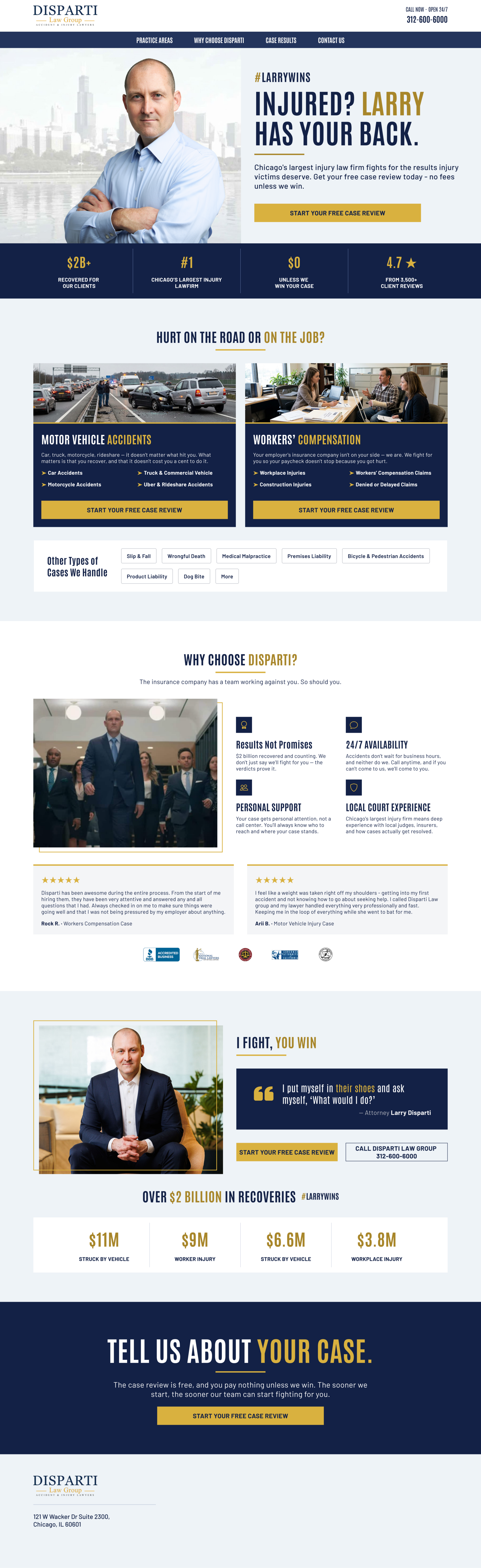
Desktop: "Hurt on the road or on the job?" The two cards share the row,
and the chips sit on a quieter strip underneath.
and the chips sit on a quieter strip underneath.
Primary
Photo cards

Real scenes, a highway crash and an office consultation,
so visitors recognize their own situation in a second
so visitors recognize their own situation in a second
Navy cards with a gold rule under the photo and one
gold keyword in each title
gold keyword in each title
Four sub-cases each, so a truck or rideshare victim sees
their case named
their case named
Each card ends in its own gold CTA
Secondary


White with a thin outline: present, but quiet next to the
navy cards
navy cards
No photos and no icons, so they read as a list rather than
eight competing offers
eight competing offers
A single strip on desktop and a stack of easy tap targets
on mobile
on mobile
"More" covers every case type not listed
03 · Proof
Bring what
already
worked
already
worked
The second thing I knew going in came from our Thompson Law PPC page: case result
stats and client reviews were the elements doing the most work there. Disparti has
strong versions of both, so I built them into this page from the start.
stats and client reviews were the elements doing the most work there. Disparti has
strong versions of both, so I built them into this page from the start.
Past case results
$11M
Struck by vehicle
$9M
Worker injury
$6.6M
Struck by vehicle
$3.8M
Workplace injury
Labeled by case type, so visitors see results that
match their own accident. They sit under an "Over $2
billion in recoveries" headline tagged #LARRYWINS.
match their own accident. They sit under an "Over $2
billion in recoveries" headline tagged #LARRYWINS.
Client reviews
Two five-star reviews, one from a workers' comp client
and one from a motor vehicle client, which mirrors the
two photo cards above. A row of accreditation badges
sits underneath.
and one from a motor vehicle client, which mirrors the
two photo cards above. A row of accreditation badges
sits underneath.
The 4.7-star rating also appears in the trust bar right
under the hero, so proof shows up before the first
scroll.
under the hero, so proof shows up before the first
scroll.
04 · UX
Designed for
someone who
was just hurt
someone who
was just hurt
Visitors here are often stressed, in pain and on a phone. Every UX decision aims to cut the
effort between "I need a lawyer" and talking to one.
effort between "I need a lawyer" and talking to one.
One action, everywhere
Every section ends with the same gold "Start your free
case review" button. Visitors never have to scroll back up
to act, and they never have to choose between competing
buttons.
case review" button. Visitors never have to scroll back up
to act, and they never have to choose between competing
buttons.
Proof before the ask
The trust bar ($2B+ recovered, Chicago's largest injury
firm, $0 unless they win, 4.7 stars) comes right after the
hero, before any section asks for more scrolling.
firm, $0 unless they win, 4.7 stars) comes right after the
hero, before any section asks for more scrolling.
A form that starts easy
Every CTA opens one modal form. It starts with simple
dropdowns about the incident and asks for name and
phone only after that. The "What happened" box is
optional.
dropdowns about the incident and asks for name and
phone only after that. The "What happened" box is
optional.
Scannable copy
Short paragraphs, arrow-bulleted case lists and big
numbers. A visitor can understand the page by reading
only the headlines and the gold words.
numbers. A visitor can understand the page by reading
only the headlines and the gold words.
Calling is always one glance away
The phone number and "Open 24/7" sit in the top right of
every screen, for visitors who would rather talk than type.
every screen, for visitors who would rather talk than type.
The fee worry, answered early
"No fees unless we win" appears in the hero, the trust bar,
the form and the final CTA. It's the biggest reason people
hesitate to call a lawyer.
the form and the final CTA. It's the biggest reason people
hesitate to call a lawyer.
Few exits
No full site navigation and no outbound links to other
pages, so paid visitors stay focused on the case review.
pages, so paid visitors stay focused on the case review.
Mobile isn't shrunk desktop
The trust bar becomes a 2×2 grid, cards stack with their
CTA directly underneath, and chips become full-width tap
targets.
CTA directly underneath, and chips become full-width tap
targets.
05 · Process
Brief to live
in one week
in one week
The whole page went from brief to launch in a week. Because I knew the direction after
reading the brief, I designed the desktop and mobile layouts straight through in Figma
without a round of concepts.
reading the brief, I designed the desktop and mobile layouts straight through in Figma
without a round of concepts.
To speed up the build, we used Claude to connect Figma with Unbounce and develop the
pages from the approved designs. That cut out most of the manual rebuild, so the time
saved went to review, tracking setup and QA.
pages from the approved designs. That cut out most of the manual rebuild, so the time
saved went to review, tracking setup and QA.
Figma design
Claude: Figma to Unbounce
Unbounce build
Tracking + QA
Live in 1 week
06 · Full page
Section
by section
by section
Desktop

1
2
3
4
5
6
7
1
Hero
Larry against the Chicago skyline, so the personvisitors searched for is the first thing they see.Gold falls on one word: "Larry."
2
Trust bar
A navy band with four gold stats in an even
four-column rhythm.
four-column rhythm.
3
Practice areas
The cards-and-chips system: two photo cards,
then a quiet strip of chips.
then a quiet strip of chips.
4
Why choose Disparti
A team photo with an offset gold frame, four
reasons with navy icons, and two client
reviews.
reasons with navy icons, and two client
reviews.
5
I fight, you win
A second portrait of Larry next to his quote in a
navy block, with both the form and call buttons.
navy block, with both the form and call buttons.
6
Case results
Four headline recoveries on white tiles under
"Over $2 billion in recoveries."
"Over $2 billion in recoveries."
7
Final CTA
Full-width navy with the largest type on the
page: "Tell us about your case."
page: "Tell us about your case."
07 · Mobile
On the phone
The full mobile page.

The case review form, opened from any CTA.
08 · Outcome
Shipped
Live
Shipped in 1 week
Desktop + mobile
Built in Unbounce
Tracking set up for forms and calls
The page is live for Disparti's branded search campaign, one week after the brief.
Performance data is still coming in.
Performance data is still coming in.


