Food Culture
Finding and cooking food shouldn't be hard. Food Culture aims to provide its users with a wide variety of recipes, along with an AI Chatbot that will help you decide what to make. I worked as a solo UX designer, designing end to end, from UXR to testing and reiterating to ensure a seamless experience.
Date
February - May
Context
2023
Mobile IOS project working as a solo UX designer with 1 software engineer.
Role
UXR
UX + UI Design
Tools
Figma
Zeplin
Deliverables
Competitive Analysis
User Interviews
Paper Research
Task Flows + Diagram
Grey-scale Wireframes
Usability Test
Style Guide
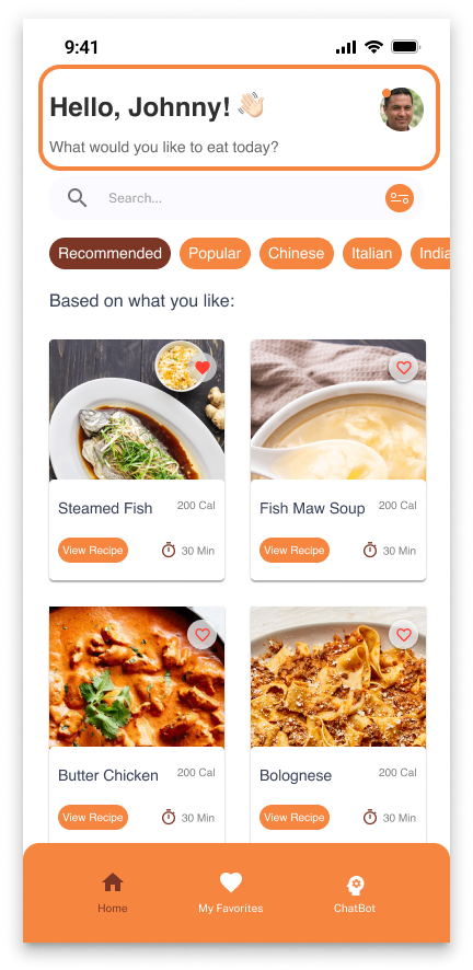
High-fidelity Mockups
4
2
Understand
Research
Hand to Development
Discover
Deliver
1
Define
Emphasize
Ideate
Design
Prototype
Test
3
View Full Figma File
Background
We live in a world where there are so many cultures and people. We all have food that either reminds us of home, or is something we have always wanted to try. Nutritional applications in the market are falling short in terms of cultural recipe options and customization features, making it difficult for people to find recipes that align with their cultural interests.
Hypothesis
People tend to look for recipes that are from their own culture and are usually deterred from your standard recipe apps because they are low in variety. Because it takes more effort to find these recipes, people tend to cook less. If there was a way to easily access recipes that they’re looking for, people would be motivated to cook more often.
How might we help users find recipes that align with their cultural interests and fitness goals?
?
Discover
White Paper Research

Before diving into design, I wanted to conduct some research to see if there is a positive correlation in using applications to help with health and wellness.

According to a recent survey, the number of health or fitness app users in the United States increased from 68.7 million in 2019 to 87.4 million in 2020, a 27% increase in just one year—and that number is expected to increase (https://www.statista.com).
78% of health-conscious consumers believe that the social and community components embedded in fitness apps make it easier to practice healthy habits (https://www.kantar.com/).
Discover
What does this mean?

With the rise of technology, people are moving to use health applications to help keep track of their healthy habits. These applications also assist them in maintaining or changing their habits to reach their goals. Food Culture will aim to assist people within this space to provide them with recipes best suited for their dietary needs and food tastes.

Discover
User Research

After seeing some research and competition within this space, I wanted to hear first hand my target audiences' experiences to cater the final product to their needs.


I reached out to 8 users and interviewed 5 users to understand their experience with using nutrition and wellness apps in the past.

Learning about apps users have used in the past to understand what they liked and didn’t like (pain-points) about the app.
Research Goal #1
Can you tell me about the nutrition app(s) you've used in the past?
Have you ever had any challenges using the nutrition app(s) and recipes?
Have you ever received any support or guidance from the app(s)?
To determine what users want and need in a nutritional/recipe app.
Research Goal #3
Learning about the user’s cooking habits and the criteria needed (goals) when it comes to finding a recipe.
Describe your ideal nutrition/recipe app.
Research Goal #2
How often do you cook?
How do you decide which recipes to make?
Interview Questions
How do you use the app(s) to find recipes?
Interview Findings and Insights
Current applications have a low variety of recipes and users wished there was a more cultural selection of recipes.
Insight #1
Users would like a guide within the application that will provide information on how to use the app and advice based on their needs and wants.
Insight #2
Being able to customize different recipes to their taste and dietary restrictions are important to them.
Insight #3
Users want to see the nutritional value of what they are eating.
Insight #4
Define
Persona

I generated a persona to better understand our potential user's needs and goals. This persona was created based on the user insights I obtained in the user interviews. This persona played an essential role of keeping us in the loop throughout the project.

Persona
Design
Ideation

I focused on creating an MVP that would meet the user's core needs. My approach was create a product that implements a very short questionnaire before delving into introducing the core features of the platform. In other words, our users would need to answer 2 main questions before being recommended with recipes that would be best suited for our users. I began ideating, knowing how I wanted the product to look like.

Building an MVP
To allow users who would like to cook more cultural recipes and easily find recipes by providing a reliable platform with a variety of recipes and AI help at their disposal.
Building an MVP
Pain Points
  • Lack of cultural options within current applications.
  • Inability or difficulty to find recipes users like.
  • Difficult to think of what they want to eat.
Feature Requirements
  • Database with recipes from all or most cultures.
  • Clear over-view of ingredients, time needed and end result to cook a recipe.
  • Button to save recipes.
  • Questionnaire for users during onboarding.
  • Platform tutorial for users during onboarding.
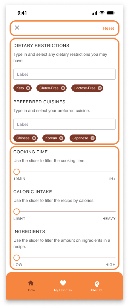
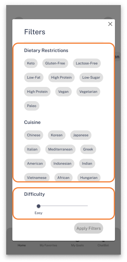
  • Filter options to pin point and tailor recipes.
  • AI Chatbot that can suggest recipes and recommend recipes.
User Flow
After deciding on the features of the app, I created a user flow diagram to visualize all possible navigation flows and evaluate if I had considered all the necessary screens for the MVP to work seamlessly.
Questionnaire will ask users of their food preferences and dietary needs.
Platform tutorial will teach users on how to use the platform and introduce the features available.
The Homepage will display the recommended recipes based on the answers users answered within the questionnaire.
Users can search for recipes directly or filter to what recipes they are looking for that day.
For a more customized approach, users can speak with Chatbot for the AI program to recommend recipes and can continuously tailor recommended recipes based on the user’s answers.
1
2
3
4
1
2
3
4
Design
Greyscale Wireframe

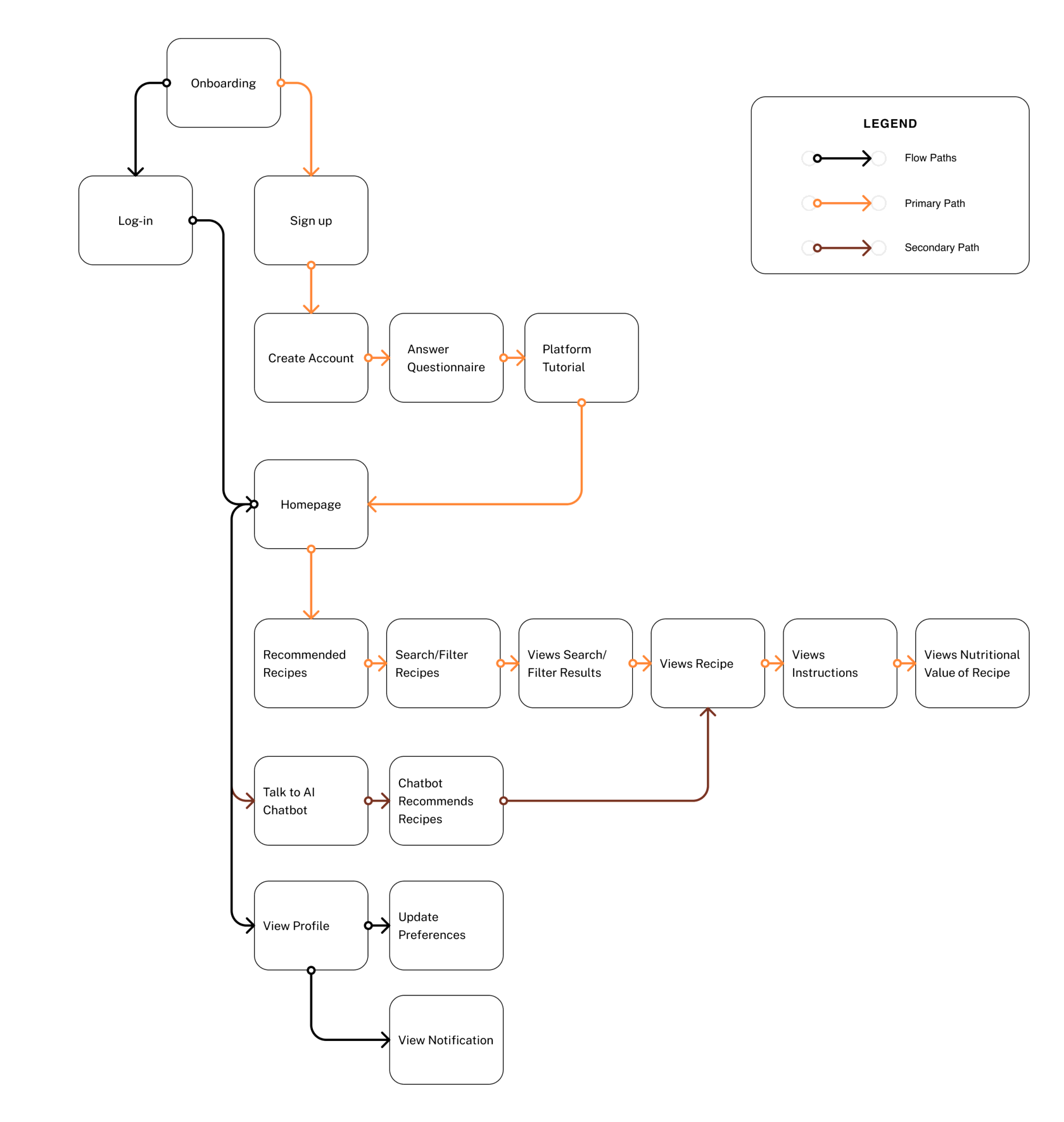
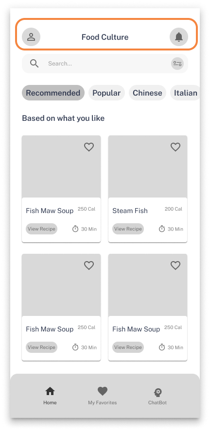
Based on our design goals and insights, I have created grey scale wireframes to serve as a visual guide for the skeletal framework of our app or platform. These wireframes are essential in organizing the interface elements and prioritizing functionality and structure over aesthetics, which streamlines the design process.

Greyscale Wireframes
Design
Usability Testing

To check if my wireframes make sense, I conducted usability testing on 5 random people at a cafe to see if there are any changes or improvements needed for a better understanding of the wireframes.

Choosing a Visual Direction
Hex #F5853F is a bright orange shade. Orange is a warm color that can evoke a sense of warmth, creativity and enthusiasm. This color was chosen because we want the application to be attention-grabbing and exciting. It also adds a stimulation and playful quality to the application and adds a sense of boldness and confidence to the overall presentation of the app. Overall, incorporating this color as the primary color of this app creates a mood of energy, excitement and positivity which is what I want our users to feel while using this app.
Overall, incorporating this color as the primary color of this app creates a mood of energy, excitement and positivity which is what I want our users to feel while using this app.
Hex #7C3626 is a brownish-red shade. It invokes the mood of stability, reliability and sophistication. The brownish hue represents a sense of seriousness while the red undertones can bring out hints of passion and energy. This color can also be associated with warmth and coziness making it a comforting color. Furthermore, this color can create a mood of grounded-ness, comfort and elegance that can enhance the app and can add a sense of luxury while conveying a sense of coziness. This color is not only versatile but sophisticated. By adding this color as a secondary color, I want to convey comfort and reliability to my users.
By adding this color as a secondary color, I want to convey comfort and reliability to my users.
I chose Helvetica to be the font because Helvetica is a sans-serif font that has gained a reputation for its clean, minimalist design, which makes it a great choice for this app. The font's simple and unadorned lines can make text easy to read, ensuring that important recipe information is easily legible, even at smaller sizes. Additionally, Helvetica can help to create a sense of clarity and consistency in a recipe or food application and its minimalist design helps to avoid any distractions or visual clutter that may detract from the content, ensuring that the focus remains on the information being presented. Helvetica can also lend a modern and up-to-date look to a recipe or food application. Its timeless design has been popular for decades, and its use can help create a contemporary look and feel that appeals to younger or more design-conscious audiences. Overall, I chose Helvetica because this font can aid the design in creating a professional and visually appealing recipe or food application that is both functional and aesthetically pleasing.
Overall, I chose Helvetica because this font can aid the design in creating a professional and visually appealing recipe or food application that is both functional and aesthetically pleasing.
Design
High-Fidelity Wireframes

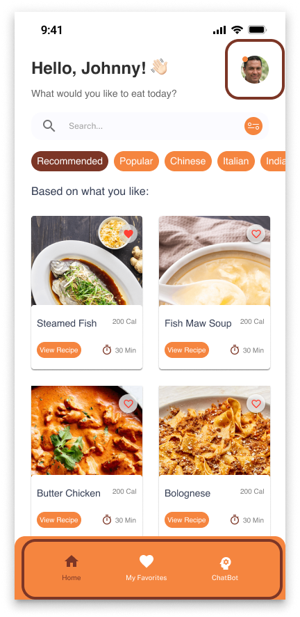
Incorporating the feedback I received from the grey-scale wireframes, I proceeded to create the high-fidelity wireframes to bring the application to life. By doing so, the high-fidelity wireframes showcase the changes from the grey-scale wireframes and demonstrate how a design concept evolved into a fully realized product.

Dashboard Changes
Combined My Profile and Notifications and used the additional space to personalize the Dashboard.
Filter Changes
Changed chip select of filters into a search, select function.
Elaborated on difficulty by changing verbiage and added additional filtering options.
Changed popup into a full-size page with a reset button of filters so users can clear filters with one click.
Design
Re-iteration + High-Fidelity Testing

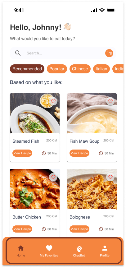
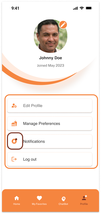
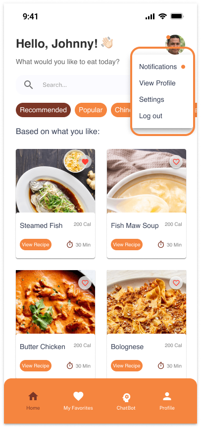
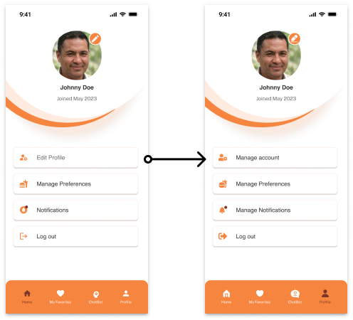
I wanted to test the product one more time in a usability test, to see if there are any final changes needed before production. I reached out to 10 users and got 6 responses back. I then conducted a usability test with these 6 users. The overall feedback was well received, with the main criticism being on the "My profile" + "Notification" feature. Listening to this feedback, I re-iterated the high-fidelity to create our final design.

Final Dashboard Changes
Users expected my profile to be at bottom navigation at first glance.
I moved the upper hand profile to the bottom navigation, where users can access anything related to their profile and notifications.
My Profile Changes
Gave my profile its own page rather than a menu. Users did not see the need between “view profile” + “settings” so the two is combined into “edit profile”.
When the user has a notification, there will be a badge within the notifications section and the profile on the bottom navigation.
Notable Quotes from Our Users
Wow I like that I see different kinds of foods... Fish maw soup? That's Interesting.
- User 1
Ah... this is the my profile section... It's a little out-dated in my opinion. But I guess it serves its purpose.
- User 2
This looks great! The chatbot feature is really cool.
- User 3
"
"
"
"
"
"
Design
Final UI Changes

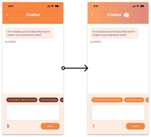
After completing the design, I made a version 2.0 with some final UI changes before handing off designs to development through Zeplin. These changes include change of icons, and some color changes.

My Profile Changes
Reason
I decided to change the iconography of the bottom navigation to a more cohesive icon set. All icons now contain a more “rounded look” and Chatbot is changed to a more fitting ‘robotic’ icon imitating a chat bubble.
Reason
Favorite icons are changed to match the rounded heart in the bottom navigation for consistency.
Reason
Amount of ingredients, time and favorite icons on the recipes page are changed. I realized that the amount of ingredients icon did not make a lot of sense. Additionally the new icon for amount of ingredients may look too similar to the clock icon, so I changed the time icon to an hourglass. The favorites/saved icon is changed to match the favorite icon for consistency.
Reason
Colors on the top are changed into a gradient background because the solid orange color is little harsh and not the focus on the screen. Chatbot icon is added next to ‘Chatbot’ name to make the page more personal. Chip color and attachment icons are changed to primary color instead of secondary color because the darker secondary color provides the chips to have too much focus, and I want the focus to be within the messages itself.
Reason
Edit profile picture icon, edit profile icon, manage preferences icon, manage notifications icon and log out icons are all changed to match bottom navigation icons for UI consistency.
Deliver
Final Wireframes + Development

With the final UI changes, I delivered the final hi-fidelity wireframes to the developers. As a UX designer, handing off my findings and wireframes to the development team for production is a crucial step in the success of a digital product. After conducting extensive user research and crafting detailed wireframes, it's my responsibility to ensure that the development team has all the necessary information and resources to bring the product to life.

Clear communication is essential during the handoff process. Therefore, I took the time to explain my design decisions, provide any relevant documentation, and answer any questions that the development team may have. Additionally, I plan to closely collaborate with the development team throughout the entire production process, providing feedback and making adjustments to ensure that the final product meets both user and business needs.

Next Steps

I loved working on this project every step of the way. Combining my love of food with my love of ux, I am so happy to see this come to life. Currently, I am still working with the development team to bring this application to the IOS store.


Food Culture right now, consists of the basic functions needed for a recipe application. Once that is implemented and developed, I plan to test the application further and add additional features.


Some features that will come in the future, include the following: add a friend feature to encourage recipe sharing, goals feature to encourage users to meet their fitness goals and more. I can't wait to refine this application further and provide users all around with a simple tool to help them cook and eat better.